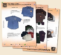
How catalog designs boost sales
By Catalogs Editorial Staff

In catalog designs, everything from color to layout affects your product sales
Novice catalog merchants sometimes operate on a single premise: If you get it in a picture, write a line or two about it, then print it on a bunch of pages, you have a catalog that will sell your product effective, Sadly, these marketers are wrong. And unless they’re in a really narrow niche, they usually end up paying for it with poor sales and wasted mailings.
The fact is, the choices you make in your catalog designs are just as important as the products you choose to sell. Surprised? It’s true! The fact is customers judge your product in large part by what they see..and if it looks bad, they assume it is bad. And they don’t buy.
So which element of catalog design matter? Here’s a quick overview of the five things you need to think about before you issue your very next catalog.
Layout
Some catalogs appear to have the merchandise randomly sprinkled throughout, with little or no regard for shopper ease. Others go to the other extreme, and put all of one thing on a given page, all of another on a different page.
~
But research into catalog shopping behavior has shown that in many retail industries arranging items into functional groups increases both the customer’s perception of value and the overall conversion in sales dollars. So, for example, a clothing catalog presents full outfits, from shoes to shawl, generally performers better than one which isolates all the skirts on one page and all the sweaters on another. And this holds true for both print and online catalogs.
This finding is flip-flopped for certain B2C catalogs and most B2B catalogs, too. Consumers who are using catalogs to shop for things like electronic and automotive supplies prefer product-sorted layouts, as do almost all B2B shoppers. (The one exception to the latter is in so-called “soft” Human Resource catalogs where functional groupings do better.)
Size is another layout factor for print catalogs, which smaller, less expensive to print catalogs generally performing more poorly in B2C industries. No significant difference perception or sales was noted in catalog size was noted for B2B catalogs.
Color
Artists know color matters, and the research on color and customer perception supports that, too. According to color theory, certain colors inspire certain behaviors, while others reduce the likelihood of other behaviors (thus all the ugly green walls in older hospitals and government buildings … it was thought to reduce aggression.)
Make sure the colors you select for everything from page backgrounds and text to elements in your environment shots or the items you choose to feature convey the right message for your business and goals.
Photography
Think of your catalog as a store a customer can hold in their hands. So what’s missing? That’s right … with a catalog, it’s not possible to pick up, rotate or look at a product in detail. That’s where your photography comes in.
Make sure the photos you choose for your catalog:
- Are crisp, clear and in focus
- Provide a good representation of what the item really looks like
- Allow shoppers to see important features or details
- Are true to color
If you’re creating an online or virtual catalog, do incorporate tools to allow shoppers to enlarge and rotate items. Your sales may go up, but even better will be a drop in returns as customers can shop with more information at their fingertips.
Content
The words that you write about each item are the only sales pitch you get to make to whomever is holding that catalog. So shouldn’t the words provide the information someone needs to make a purchase choice?
Yes, catalogs page real estate is expensive, but skimping on content won’t help you if people decide not to buy because you haven’t provided enough details. It’s a balancing act, but in general providing enough clear, useful, and maybe even fun copy as a part of your layout choices will help boost your sales, and increase the likelihood of someone sharing the catalog, too.
Just make sure what you write is honest. People who feel tricked won’t be back for a second visit.
Order forms
While I was working on a new catalog launch for a client, the subject of the order form came up. Some thought it wasn’t needed, since a large percentage of sales occur via phone or web. Others voted for it, just in case. We did our research and discovered that including an order form in a paper catalog increased sales even among people who didn’t use it to mail in an order!
Why? First, the order form usually arrives custom printed with the customer’s name, address and customer number, as well as any other customer details they might need to place the order. Second, the form itself acted as a wish-list for items someone was thinking of buying. Third, in the case of B2B buyers, the form acted as a way to show a manager or supervisor things they were thinking of ordering, and starting on the approval process.
Without an order form, shoppers felt they had to devise all kinds of ways to mark items they wanted…and they often abandoned the plan to buy in the process.
For online catalogs, a virtual wish list or an in-app shopping list served the same purpose. But amazingly, customers who had both a paper catalog and access to the online version often used the paper order form to keep track of their possible online items!
How does your catalog compare?
Grab your most recent catalog, and see how it compares to the five tips. Are you on target, or might some more attention to your catalog designs make a difference in the bottom line?
Popular Savings Offers


